If you're anything like me, you'd like to keep track of how things are going with the United States economy - what to expect for the price of gas and heating oil, interest rates, the housing market and more - before hearing about it on the local news.
But, like me, you're not an economist, hedge fund manager or a professional investor so it can be difficult to know where to look and what the data means.
That doesn't mean we're any less impacted by what occurs in the macroeconomic landscape, however, it just means that we have to try a little harder to understand, track down resources and bookmark links so that we can stay up to speed more easily.
That's what I intend for this post to be - a comprehensive list of resources and links that anyone can refer to quickly and easily know what's happening in the U.S. economy and what it might mean to them both now and in the future.
Again, I'm not an economist, so if you know of any resources that should be included or I didn't properly explain a link, please correct me in the comments below!
General Economic Data
- Balance of Trade: The balance of trade has become more commonly known as the "trade deficit" because, since the 1970s, the balance has become more and more negative. The greater the deficit means the more dependent the U.S. is on importing goods from other countries.
- Federal Funds Rate: This is the interest rate that banks charge each other to borrow or lend excess reserves. Banks and lenders then pass on these rate fluctuations to the consumer after tacking on their own rates. See also 30-Year Fixed Mortgage Rate.
- Gross Domestic Product: GDP is a measure of the value of goods produced. The data in this chart shows the running GDP since 1950 as well as shading where U.S. recessions occurred (when GDP actually went down).
- Inflation Rate: This bar chart shows the annual inflation rate each month and is updated monthly. For example, inflation was 8.2% in September 2022 compared to September 2021, which was about 5.5% compared to September 2020. For the past 50 or so years, the average inflation rate has been between 3-5%.
- National Debt: The current U.S. national debt as well as a breakdown per person and what it might could mean to the future of America.
- Unemployment Rate: This chart shows the seasonally-adjusted unemployment rate going back 20 years and is filterable by race and age.
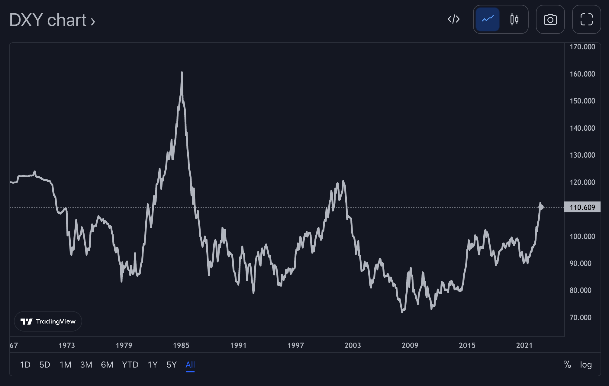
- U.S. Dollar Currency Index: The DXY shows the strength of the United States dollar compared to the currencies of other countries. The dollar tends to rise in uncertain economies. It's also usually inverse of the stock market. When the DXY goes up, stocks typically go down and vice versa.
- Yield Curve: The Yield Curve refers to investing in bonds and what investors would expect to receive (or yield) from bonds investments over time. Normally, we would expect a longer-term investment to return more than a shorter-term investment. For example, if I bought Amazon stock and held onto it for 10 years, I would expect it to give me a greater return then if I held onto the stock for only 1 year. But, if I thought the economy was going to turn bad over the next couple of years, maybe I wouldn't be so confident about my 10-year investment. That's where the yield curve comes into play. The curve becomes "inverted" when bond investors expect higher returns now than in 10+ years down the road. When this inversion happens, it often precedes an economic recession.
Specific Economic Data
- 30-Year Fixed Mortgage Rate: The current and historical rates for a 30-year fixed mortgage. This is the expected or average rate received given the consumer has at least a fair credit rating (~620+) and greatly impacts the amount the consumer will have to pay in interest (per month) on their mortgage loan. Higher rates typically mean lower home prices.
- Average Price Data: This chart shows the average prices of common items (e.g. bananas, eggs, gasoline) over a 20-year period.
- Consumer Price Index: This is a table that shows the most recent, 12-month percentage rise in price of various consumer products updated monthly.
- Consumer Sentiment: This chart shows how confident U.S. consumers are of their personal finances, business conditions and the general economy. The data comes from surveys of U.S. households organized by the University of Michigan. This is usually a lagging indicator of the actual economic environment - meaning that people generally are slow to respond to poor economic conditions, and tend to continue to feel negative even after the economy has rebounded (Warren Buffet described this behavior post the Great Depression).
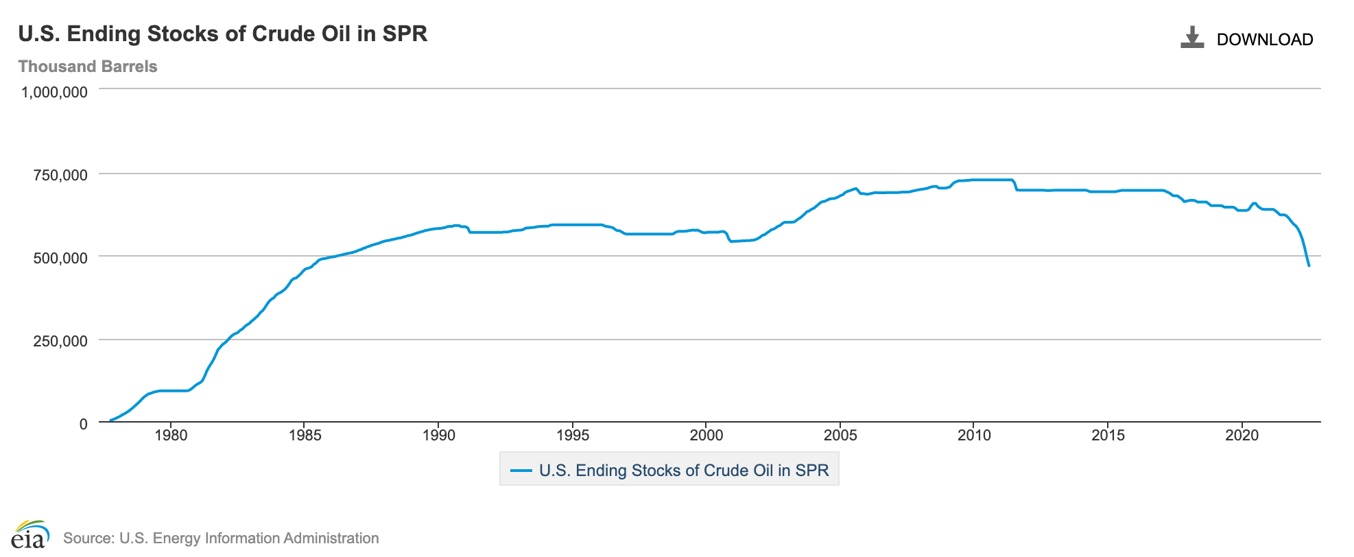
- Crude Oil Reserves: This chart shows the amount of oil remaining in the Strategic Petroleum Reserve. In 2022, a large amount of oil was removed from these reserves to lower the price of gasoline, but when the amount of oil dwindles, the demand will surpass supply causing large price increases impacting every part of the U.S. economy.
- Dow Jones Industrial Average: The DJIA is an index that measures the performance of 30 of the top companies in the world. It's long been considered one of the best indicators of the general performance of the stock market. You can learn more about what it is and what companies are included here.
- Employment Cost Index: This table shows the percentage increase in employee compensation during the previous 12 months and is updated every 6 months. If the percentage increase in the Employment Cost Index isn't keeping up with the percentage increase in the Consumer Price Index, then the average American's purchasing power of everyday items is decreasing.
- Employment Situation Summary: This resource is similar to the Civilian Unemployment Rate chart above, but shows the data in table form and includes further breakdowns of data including total workers, total unemployed and breakdowns of different races, genders and education levels.
- Food Price Index: Like the Consumer Price Index, but is in chart form, focuses on the price of food and goes back several years.
- Freight Rate Index: This data shows the cost of transporting large amounts of goods from one port to another or, in this case, as an index considering all ports. We saw a huge increase in the cost of freight post-pandemic. If things cost more to ship, then you know that the prices of goods will be raised to cover those increased expenses.
- Gasoline futures: The gasoline futures index measures forward-looking risk expectations and implied volatility. Basically, it's an indicator of future expected gasoline prices (although there are many other factors that go into what you pay at the pump). You can learn more information about the RBOB index.
- House Price Index: This chart shows the average price of houses in the U.S. - updated monthly.
- Median Weekly Earnings: This chart shows the median weekly earnings of full-time employees filterable by sex.
- Personal Savings Rate: This chart shows current and historic data of the average personal savings of Americans as a percentage
- Purchasing Managers' Index: The PMI summarizes market conditions (expanding, staying the same, or contracting) from the perspectives of purchasing managers. A value above 50 represents an expanding or growing economy, while a value below 50 represents a contraction or shrinking economy.
- Retail Heating Oil Price: This chart shows the average price of heating oil in the U.S. You can also select your individual state. The data is updated weekly.
- Retail Propane Price: This chart shows the average price of propane in the U.S. Looks to be updated only during the winter months.
- Retail Sales MoM: This chart shows the rolling retail sales month-over-month (for example, how did the current month's retail sales in the country compare to last month's?). Retail sales go down when consumers purchase less, and consumers purchase less either because they have less purchasing power or are fearful of the economy and are aiming to save their money.
Miscellaneous/Exploratory
- CEO Confidence: The health of the U.S. economy from the perspectives of U.S. CEOs. Also, their thoughts on demand of their products, 12-18 month outlook, and input cost changes.
- Google Trends for "Recession": Get a pulse on the current interest or fear felt by other Americans by seeing how many users are searching for "recession" in Google search. See also searches for "economic depression".
Links
There are a few sites referenced above that have additional data you may be interested in:
0 comments
Sign up or log in to join the conversation.